Continuing this month’s apparent theme of being late, and my recent mumbling about my personal websites, I totally neglected to remember a rather significant anniversary that came and went earlier this year: This year is my twentieth year as a website developer!
I figured I should take a look back at how I ended up being here, by looking back at my timeline of personal websites.
I’m not gonna be linking to the actual websites or Wayback Machine archives, and screenshots will have some information redacted.
These websites often included personal information about myself and others that I wouldn’t be comfortable sharing online these days. Some things are best left in the past.
Genesis
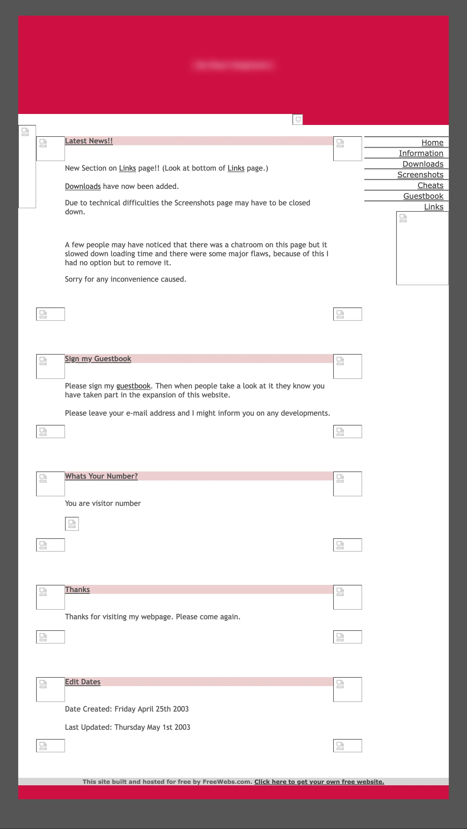
It was 25th April 2003, whilst kinda bored during a visit to my aunt’s house in Cardiff, that I first laid code to text editor. A little of it, at least. My first website was about The Sims video game. Creatively named “The Sims on the Web”, it contained information you could find a hundred other places online: cheat codes, snippets of info about upcoming expansions and the then-revolutionary The Sims Online, screenshots from the game, and naturally it had a guestbook.
It was hosted on FreeWebs (nowadays known as Webs.com) using a pre-made template and a WYSIWYG editor, but it’s what sparked that initial interest in building websites for fun. Also, I copied and pasted in some HTML to give the site a hit counter at some point, so it kinda counts.
The limitations of the platform became quickly obvious. FreeWebs only let you have seven pages on a single website unless you paid for more. I was eleven years old. I was not going to be paying for more. Instead, I just made another account and a second, identical-looking website called “The Sims on the Web 2.0” to handle the overflow content. Ingenious move, past me.
It didn’t take long for me to move away from FreeWebs. It was, after all, a rather purposefully limited platform—intended only to be free for small, simple, sites and demanding money for anything more complex. And there was a growing urge to make something much more… custom.
Exodus
I ended up moving to Bravehost (today, with almost an identical logo to 2003, Bravenet). Bravehost allowed a much higher page limit and entirely custom HTML, CSS and JavaScript for the low, low price of putting a bunch of adverts on all of your pages!
It was actually a great place to flex my first attempts at actually coding the entire website!
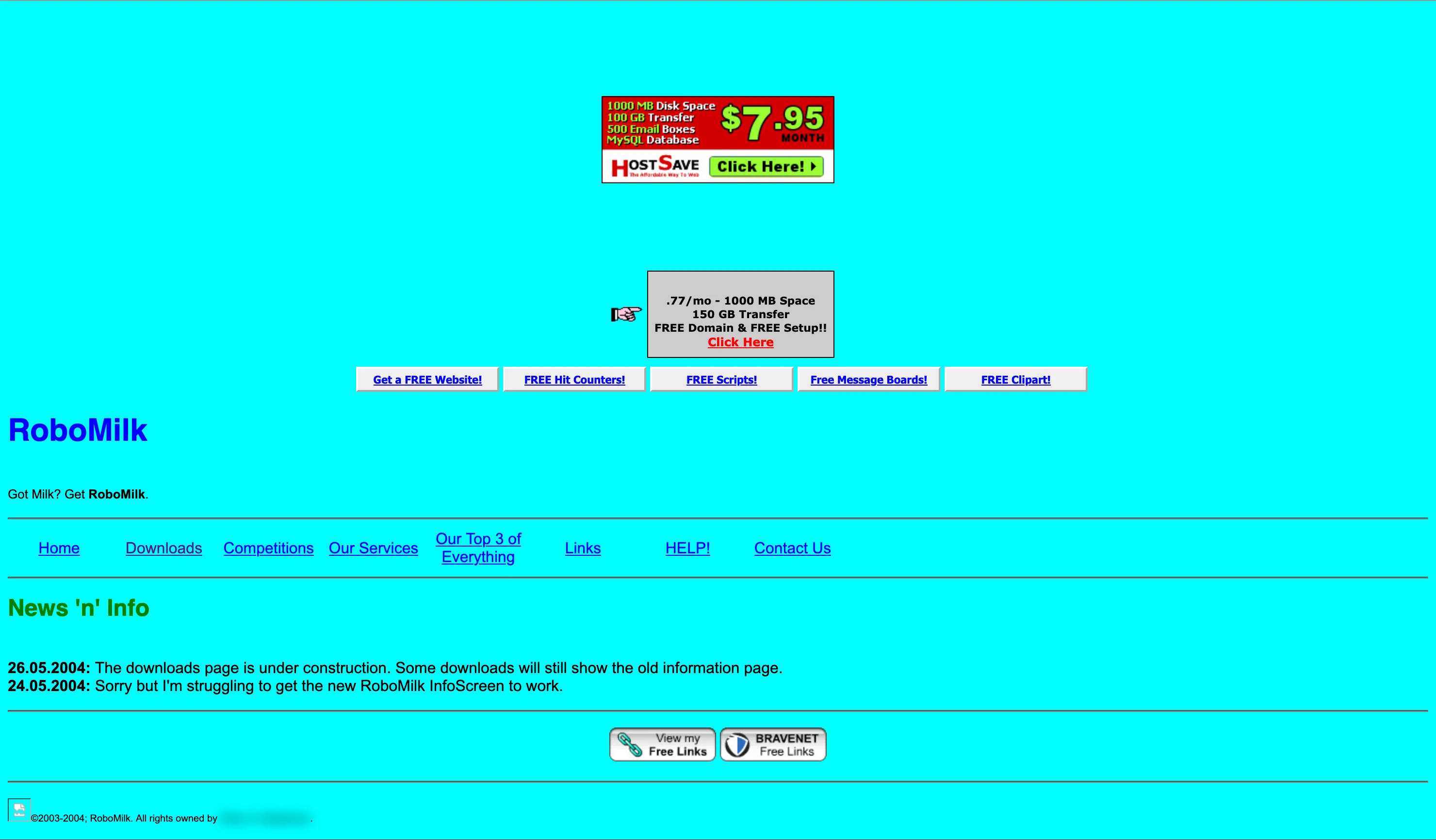
Wow… that is obnoxiously blue, huh. This is also the first appearance of the “robomilk” moniker, my first online username and one survived to this day by my still-active Last.fm and Wikipedia accounts.
The code is bad, maybe even for the time. At this time, I was learning how to code from a beginner-friendly book that only covered HTML, so I was using font and bgcolor attributes like a madman.
Still, the starting gun was fired, and much like my modern crippling need to constantly iterate my personal website, the RoboMilk website underwent a complete redesign basically every month.
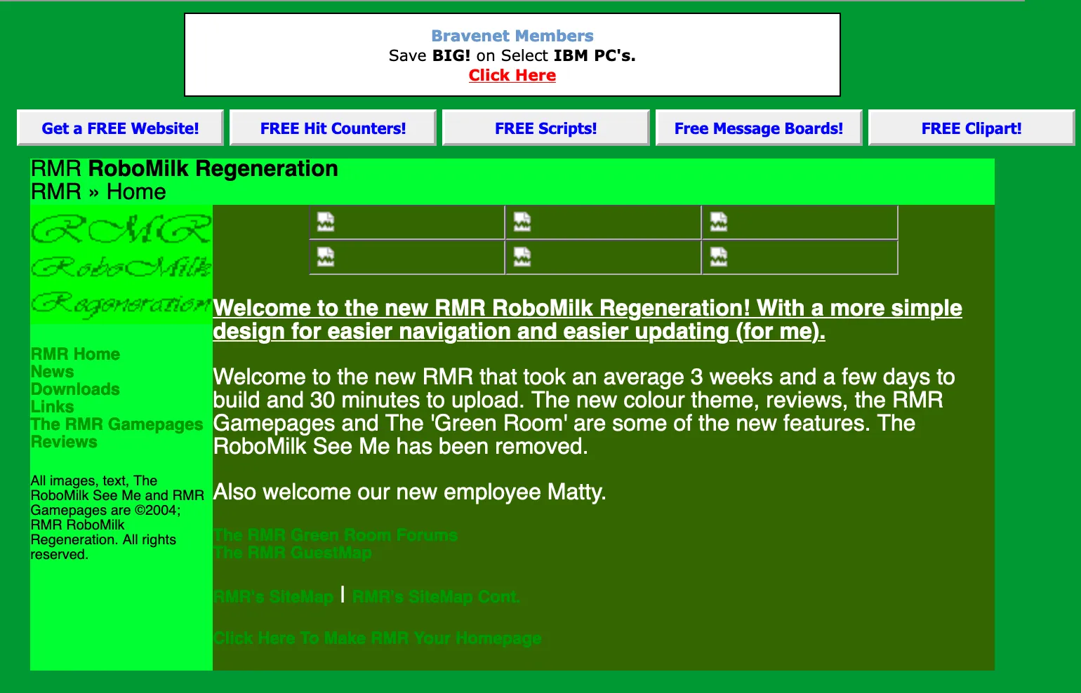
Version two had tables! For layout! And all my styles were still HTML attributes! And it was obnoxiously green instead!
Around this time I started making websites for my school friends. Probably the premiere amongst these would be “CSN Animations”—the sequel to a site called animationsx and prequel to one named Motus Animation—all of which hosted various Flash animations created by about half a dozen of my peers. It was impeccable. It had actual CSS! And rounded corners before border-radius existed!
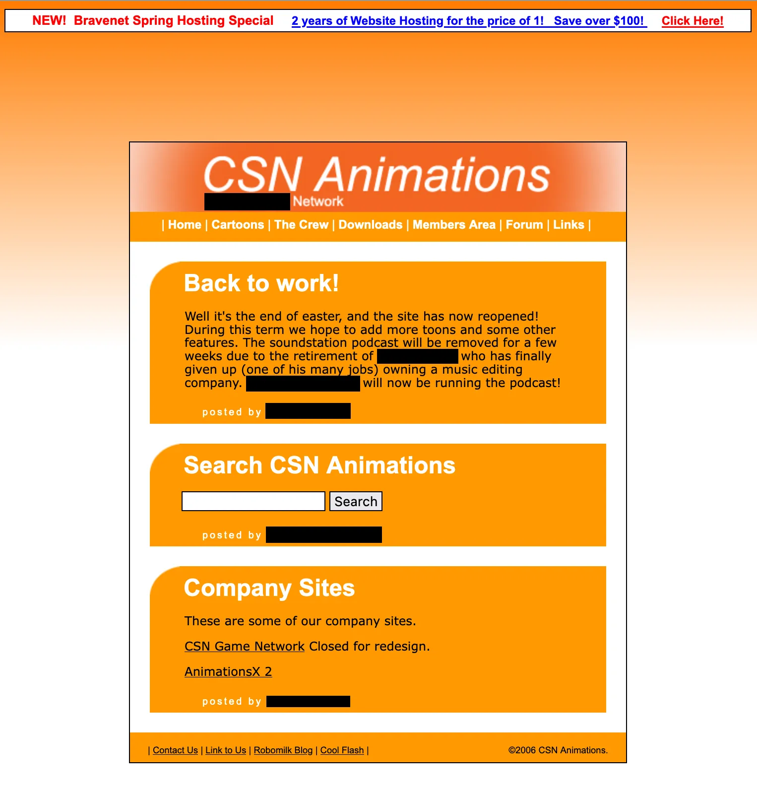
I don’t think it looks that bad even now, to be honest, if a little EasyJet.
From the latter end of the year 2005 until 2007, my personal website had gone all vogue and was implemented in Flash, so unfortunately nothing of it remains now except for a black background. This is why friends don’t let friends use proprietary software.
Revelation
In 2007, I got the opportunity to hop onto Furtopia’s web hosting, which provided my first taste of entirely custom, ad-free web hosting. It also supported PHP, which I started to dig into in earnest now it was available to me. My first use for it was writing scripts to randomise my forum avatars and signatures on page load. It was very cool.
This website wasn’t around for very long at all, probably only about a year. Unfortunately, nothing of substance seems to have survived in the Internet Archive, but it sported a very stylish off-black and yellow-orange colour scheme which might sound suspiciously familiar to users of this website’s dark theme.
Following this, there was a period of a few years where I didn’t operate a personal website, instead focusing my efforts on various projects aimed at the furry fandom like MyFursona and The Furtean Times.
Numbers
![A screenshot of a holding page from 2010, with an ASCII art representation of a bat's head in silhouette, with a gear-like symbol inside of it. Text below the art reads 'A website belonging to [REDACTED], (hopefully) coming soon.](/images/wcJ0RnCgDr-890.webp)
It wouldn’t be until 2010 that I started working on a new personal website. This was also around the time I stopped using my birth name in favour of a moniker. My university years were initially branded under the name “Furrified” (a domain originally picked up for, unsurprisingly, an unrealised furry fandom project), with the subtitle “Grey’s Adventures in Web Design”.
Building on my earlier experimentation with PHP, this was one of my first websites to be built on the WordPress content management system, a CMS I’d use for a great number of websites to the present day.
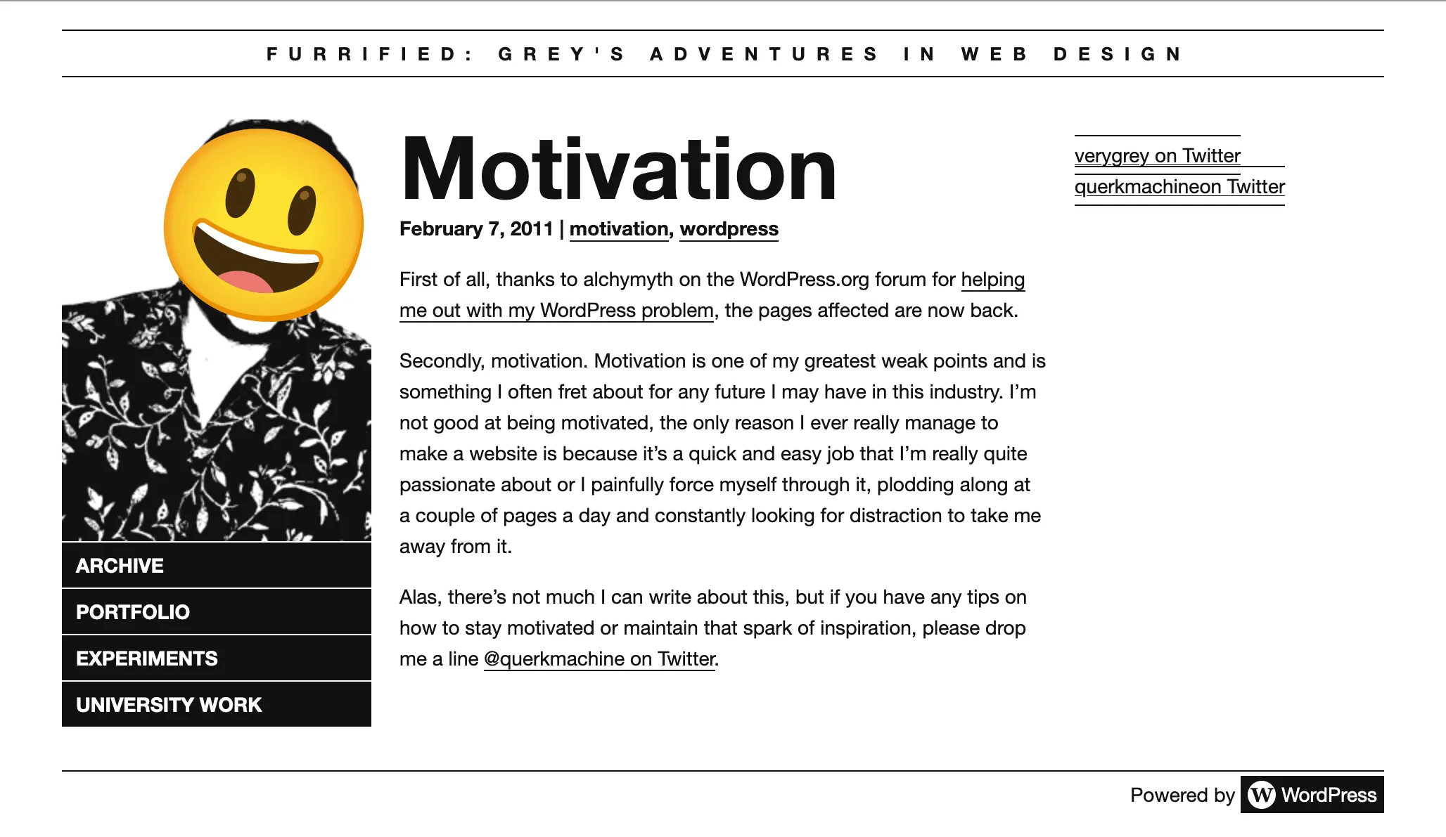
Little did I know that this would become a period of great upheaval. This website, true to my Sisyphean curse, did not survive the year and was replaced by a holding page until some time in 2012.
![A mobile screenshot of a monochromatic black and white webpage, with large bold text reading 'Grey [REDACTED]. Web developer, bit of a weirdo.' atop a halftone shaded background.](/images/r1VHgTy_ZL-900.webp)
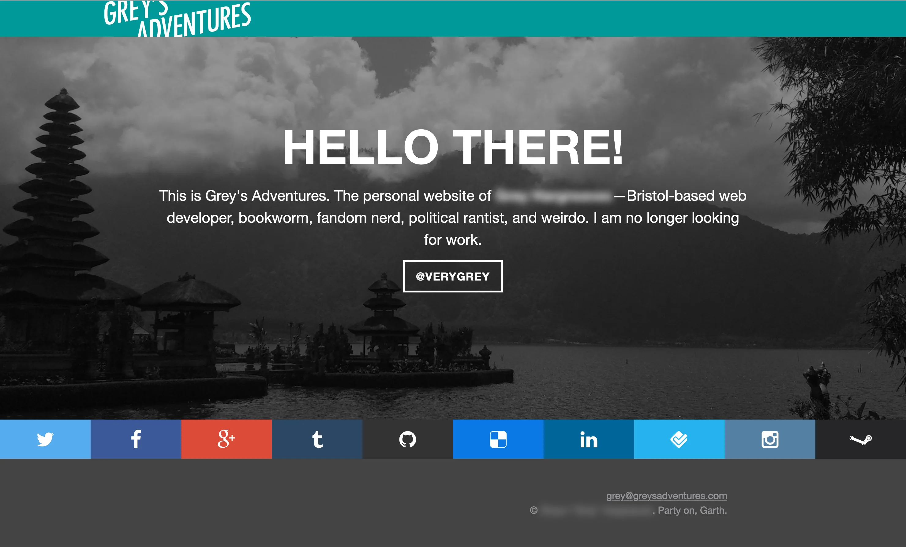
The new website, now simply retitled “Grey’s Adventures” was my first personal website (at least, that I can recall) that was responsive. This was literally less than a year after Ethan Marcotte’s groundbreaking Responsive Web Design book was released. You could say I was a bit of an early adopter.
Similar to its predecessor, it featured a rather monochrome look but was much more typography focused, being set in the still lovely Alegreya (geddit, cuz Grey??)
This website also did not last particularly long, by 2014 it had itself been replaced by a holding page. One that would ultimately exist in some form or another for many, many more years. After all, I was employed now, I didn’t need a website to sell myself with!
Still, I would make updates every few years, just to keep things slightly interesting.
This was originally set in Brandon Grotesque, though the Wayback Machine doesn’t seem to have saved that bit. I didn’t suddenly forget about typographic design, honest.
The last of the holding pages can only be truly experienced in the fullness of animated GIF.
In 2021, I would finally revive the personal website proper, and in a very Ship of Theseus way, that is the website you’re currently looking at!
The design has changed quite a lot since then, but many elements that persist to this day are there: the use of Space Mono and Space Grotesk, an abundance of robot bats, a dedicated dark theme, and hints of the same purple and green palette that the site still uses for its light mode.
Mid-2022 would see what is pretty much the current design introduced, albeit initially with a different homepage layout and dark theme—being deep blue and pink instead of the current black and yellow. It is still, absolutely, recognisably the current website in aesthetic, however.
There would be iterative changes made going forward, including a change of name and domain later in 2022.
There was a brief sojourn away from the Space typefaces towards using IBM Plex instead, but I came crawling back a few months later.
A work in progress
And that’s basically where we are today. The homepage is different, but you can just go look at it yourself unless I’ve changed it again.
It’s quite interesting just how easily I can look back at the development of my own website and pinpoint the places where I noticeably evolved in skill. From the very basic building blocks of web development (“holy crap, CSS!”) to the much more recent mod-cons (“holy crap, dark mode!”).
Who knows, maybe in a few years this website will have reverted back to a purely black and white design? Or been redesigned entirely to work better with augmented reality? Or maybe it’ll have a ChatGPT powered chatbot on it for no conceivable reason?
Past me really did have a point: web design really is an adventure sometimes.


Comments
Thoughts? Questions? You can favourite, share or comment on this post by replying to it on Mastodon.