The neat Star Trek thumbnails I released yesterday did some rounds and got a fairly positive reception, so I made some extras to cover the modern Kelvin timeline films.
These ones use an inverted, principally white colour palette, reflecting both the alternate timeline and JJ Abrams' very shiny, lens flare-filled vision of the future.

Arguably more important than the Enterprise to the Kelvin timeline is the Nerada, the ship whose time travelling schenanigans caused the alternate timeline to diverge.
It's a humongous ship, a Romulan mining vessel supposedly (according to beta canon) augmented with tons of salvaged Borg technology collected over the course of decades. As a result it's also quite pointy for... some reason. Here, it emerges from the wormhole that spawned this new timeline (or, alternatively, it is being sucked into the black hole that seems its demise at the end of the film).
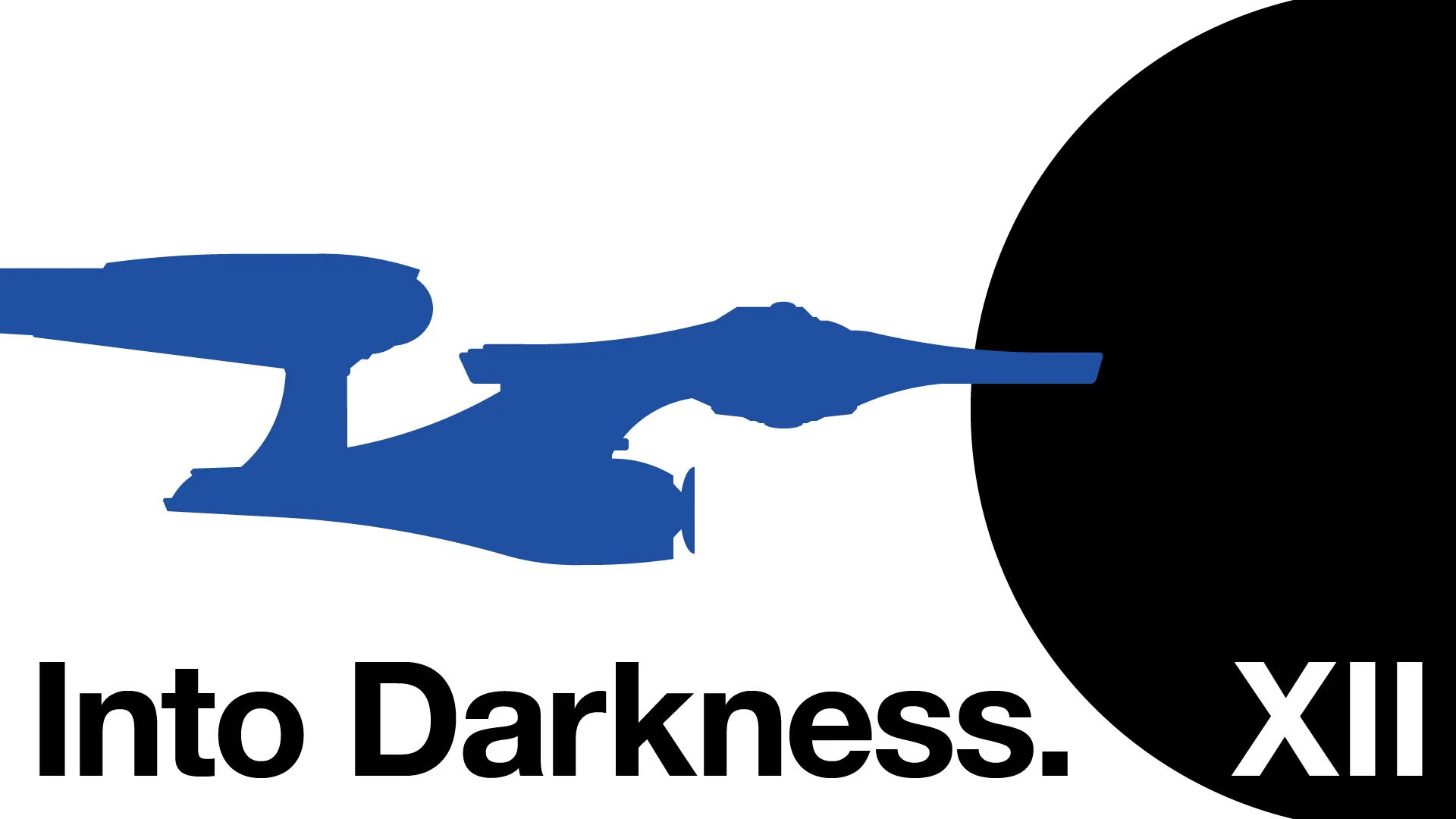
With the Nerada having stolen the limelight for the previous thumbnail, and Into Darkness's only other iconic ship being the somewhat forgettable (and very dark) Dreadnought-class USS Vengeance, I opted to use this time to show off the Abrams incarnation of the Enterprise.
I'll be honest, I quite like this take on the Enterprise, especially the warp nacelles with their simultaneously sleeker yet sturdier look when compared to The Original Series' cyliners mounted on popsicle sticks design. The all-white interior is certainly more... divisive, but it definitely fits a 21st Century perception of futuristic, Apple-ish design. Here it is shown, appropriately enough, heading into darkness.

And finally (at least so far), Beyond. I really like Beyond and the way that it (finally) brought some sort of—not just acknowledgement—but integration of the canon established in Star Trek: Enterprise into other Star Trek properties, with Balthazar Edison, the MACOs, and the star of our thumbnail, the Freedom-class USS Franklin.
The Franklin is one of the oldest Earth Starfleet ships ever shown on screen, in essence acting as a precursor to the saucer dish and two nacelles design that would define Starfleet ships for centuries to come, whilst also hosting its own distinct silhouette thanks to the large U-shaped cut-out from the rear of the vessel.
The age of the Franklin gives it the distinction of being a ship appearing in the Kelvin timeline that existed prior to the divergence in timelines. This has been depicted in the thumbnail through the theme colours I've used to group them—it is leaving the prime (black) timeline, headed into the new (white) timeline.
Three films. Three ships. And, just for fun, each ship is coloured in with the three division colours: engineering red, sciences blue, and command gold.